Story x Story: Our Podcasting Journey

mayamada February 22, 2020 No Comments

“It’s Good To Talk” – those were four memorable words from a 90s British Telecom advert starring Bob Hoskins…he was big in the 90s…look it up…

Now I’m done dating myself, let’s continue…

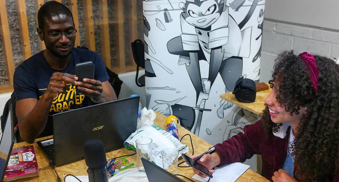
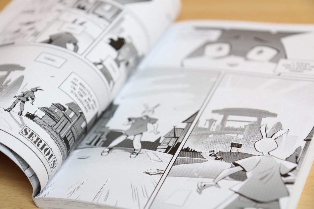
The point is that it is good to talk and be involved in great discussions around topics you care about. That thinking led us to start our new podcast, Story x Story. We talk a whole lot with friends and fans at conventions about manga, comics and gaming. Now it’s official with a microphone and an Anchor account.

Read more

A Lesson In Perseverance

mayamada August 31, 2014 No Comments

When it comes to photoshoots, this summer has been a real lesson in perseverance.

We recently wrapped up our third and final shoot of the summer. One more than we intended and counting two abandoned attempts due to weather, it’s safe to say things did not go to plan!

The past few month have been a good reminder that when you make plans you can expect them to change, or even scrapped altogether  (if the weather is bad enough).

Keep in mind that it’s not about trying to keep your plans from changing, but how to adapt when they do change. Adapt and keep pushing forward.

For us it meant rescheduling multiple photoshoots to get the photos we needed for our shop and lookbook, but it could be dinner with friends, a business project or that big event.

Whatever the plans, stay flexible and don’t get too discouraged if things don’t go smoothly. Oh and it helps to have a good group of people around to support should things don’t go according to plan.

Now, enjoy a few behind the scenes shot from our last shoot of the summer while we put together our plans for the rest of 2014…

IMG_6248

IMG_6263

IMG_6301

IMG_6304

IMG_6338

IMG_6361

IMG_6431

IMG_6396

IMG_6380

IMG_6323

Think Long and Maintain Your High Standards

Last week I came to realise the importance of keeping high standards within your brand.

We were putting together a secret gift to give away soon (can’t say what yet, that part’s a surprise) and I got to see the “completed” work a couple weeks ago.

Why the quote marks? Well those weren’t actually my words as it was quite far off what I had in mind for the final product and arranged to have the job restarted.

We could have accepted it as it was – it wasn’t a complete disaster after all. But it wasn’t good enough to represent our brand so we had to wait the extra week to have them done again and done properly.

Patience is a virtue (I guess)

It was a shame as we wanted them in time for a promotional party we were invited to, so it was frustrating for me to wait and miss that date.

However, it’s so important to set high standards your brand and not allow yourself to dip below them.  In truth, they should be raised over time – especially if you’re just starting out. We now have the finished product and they look exactly as we wanted.

Don’t rush to put things out before they are ready if the end result will be detrimental to your brand.

Though I don’t own any product with an ‘i’ in front, I do admire Apple’s no compromise adherence to the quality of their brand. More often than not they release a product when it is ready to wow people (not always the case ) and not a moment before.

Do it right, not quick

When it comes down to it this is your brand and you have to always ask yourself: “am I comfortable giving this to someone, even for free?” In this case the answer was a clear “no” and that means that however frustrating waiting is, in the long run your brand will benefit if you continue to maintain high standards.

Keep in mind high doesn’t mean perfect – very few things are, but you have to be comfortable having that item – whether it’s t-shirts, stickers, badges, hoodies or your website – represent your brand. If it’s a bad product, that’s your brand so make sure that whatever you’re giving to customers and fans is good enough to represent that.

Have you had any similar experiences? Let us know what you think in the comments or on our Facebook page.

By the way, that special gift? We’ll be handing them out at our picnic next month 🙂


Image source: electricpig.co.uk

Unfair Comparisons

Nigel March 22, 2011 No Comments

I’ve only recently been a fan of the Johnny Cupcakes. If you’re starting up your own independent clothing brand, it probably won’t take you very long to come across one of the biggest players in the market. Being based in London, I was naturally exited to here that he was opening a store right here in our very own Carnaby Street.

Given that the launch was a week ago I realise I’m a little late on this…but who wears a watch nowadays anyway?

I was one of the super fans that camped out (I don’t have the patience!) so I decided to go the weekend after launch and check out the new addition to his bakery theme shops. As well as the surprise at seeing a piece of London turned into a quaint little bakery, I also got the chance to meet the man himself!

He was kind enough to give me and a couple other t-shirt startups his time with a mini-lecture covering some of the important things to consider when starting up a brand. I’ve got to say it’s always a pleasure when people who have achieved success remain humble and accessible like that.

Looking at the launch and the reaction, I figure many people in the same position as us were thinking something along the lines of: “How could I ever reach that stage?!”

But talking with him made me realise that when you’re starting out you need to avoid comparing yourself to already established brands. It was clear to me that he, like everyone else that has started anything significant has had to struggle though the early stages.

By all means set the goal of getting to where these guys are – big ambitions are a must. Even though I’m pleased with the start we’ve made, I always want our own t-shirts to be better, our designs to be better and our brand to be better.

But it’s always worth remembering that these guys – Johnny Cupcakes, Ugmonk and Tokidoki to name a few – have been around for years and have had all the struggles and made the mistakes your going through now. You can’t expect to be a breakout hit after a year and comparing what you’re doing now to what they’ve been doing for years is unfair on yourself. It’s better to focus on your own brand and making your own path…but some help from the experts shouldn’t be ignored either!

By the way, if you are a starting brand, I advice you to check out his story. That’s not to say his way is the only way, but it should inspire you to find your way.

The Problem of the Last Mile

Nigel February 27, 2011 No Comments

Ideas are easy, but finishing is (disproportionately) harder.


Our website is almost done and we’ve also just finished rebranding efforts including brand new designs (available now).  The whole experience has been a lesson in seeing things through to the end.

Everyone has good ideas (just as the Winklevoss twins).  As I’ve learned over the past year, that’s not difficult.  You may have some good ideas, some bad ones and one or two will probably be excellent.  But generally it’s something anyone can do.

So you have a bunch of good ideas, you pick one and run with it.  Putting in the work to implement your idea ranks a little higher on the difficulty scale, but getting 90-95% of that killer idea is still quite achievable.

The truly difficult task in any pursuit, is finishing it.  Getting to 100%

That last 5-10% is where winners are separated form everyone else.  For some reason that last mile – when you can see the finishing line but aren’t quite there yet – tests you much more than whatever work took place beforehand.

I don’t quite understand it myself, but maybe Malcolm Gladwell will write a book explaining it one day.

That is when you been at it for months or maybe even years and just want to see the finishing line.  When things are taken longer than expected and when the problems seem to want to crop up.  If you’re going to be successful, you can’t stop and call it ‘done’ at 90% – you have to persist all the way.

It helps if you have a good team of people around you to fill in the gaps that you leave (like graphic design ability and patience!), but however you get there just remember that you’re not done until you get to 100%.

What For?

The pieces are coming together as we prepare for the release of our new range of t-shirts and hoodies.  We have to get the t-shirts tagged, packaged and shipped to our first customers, sort out the website and organise a photoshoot all inside three weeks.  This month is going to be crazy!

If you’ve been following us from the beginning you’ll probably have seen our previous efforts to sell t-shirts…which didn’t go so well.  I’m one for learning from failure and since then we have completely rebranded our efforts and are almost ready to re-launch.

Towards the end of last year, I was asked why we we’re going at this again after our initial efforts didn’t go as planned.  The question took be by surprise, not because I didn’t have an answer, but because it was obvious to me.  So obvious I never actually stopped to think about the answer before.

Because this is what we want to do.

Because we want to create a really cool brand that people can related to, create something that takes our interest in Japanese culture and puts our own spin on it.  Because we want to make something great.

I recently watched the Social Network and for all the negative perceptions of Mark Zuckerburg and the general concerns over Facebook (security, privacy etc), for me the biggest takeaway from that film (or “movie” if you’re reading this stateside) is that at the end of this day he went and did something great because that’s what he wanted to do. He didn’t ask for permission, didn’t check with anyone along the way (except Justin Timberlake).  He just did it and that spoke volumes to me.

Now, before someone make a crazy assumption, I’m not saying mayamada is going to be Facebook.  What I’m saying is that creating anything from nothing is hard, but that doesn’t meaning you let setbacks stop you if that’s what you really want.

So here’s to making things happen and to a great 2011 for everyone reading this!

Websites and Brand Perception

If you’ve been following us on Facebook and Twitter (you are following us right?) you’ll have seen we updated the our website.  We’ve been getting plenty of good reactions from fans and it made me realise how important a website is to the perception of a brand.  So for people in a similar position to us here a few tips from my experience …

Get the colours right

Colours are so important to perception in ways that I don’t even fully understand yet!  What I do know is that even I get a different and better feel looking at our new site than the old.
Think about how you want people to feel when they look at your site.  This isn’t just about you favourite colours but about what each one represents and how that relates to your brand.
I’m not even going to get into colour theory because I’d be way out of my depth.  However, you might want to take a look at helpful article from Smashing Magazine we used to get us to think about this.

Show, don’t tell

If you’re selling something, visitors should be able to go on the website and immediately see what you sell.  Don’t make people work for it, because you usually only have a few second before they go back to Facebook so don’t waste time!
If you didn’t know about us, it wasn’t easy to tell what we did looking at our old site.  There’s no question now: T-Shirts (OK, we do hoodies to but stick with me here I’m trying to make a point).
Pictures help in a major way as they let people see your product in action and let people get a better idea of what you are about.  Hopefully they like it and look deeper.i.e. start browsing your shop.

Let the world know!

Don’t just keep it to yourself, tell the world.  There’s always a danger of being blind to your creation’s faults,  but your site can always be improved so be on the look out for opportunities to do just that.  It is so important to get feedback from people who have had nothing to do with the development.
It never ceases to amaze me how someone can point out something that I had been staring at for ages, but never even noticed.  Plus,  getting people involved engages your audience and makes them feel part of the process, which is a good thing.

And on that note…What do you think of the new site?  How important is the website to a brand?  Let us know your thoughts here or on our Facebook page.
Don’t forget we also have to new tees ninjastar and superstar, available now in male and female.  Check them out!

5 Anime Tees That Will Make Heads Turn

Here at Mayamada we love anime, we really do! Okay, okay, it’s just me, but still, it’s hard not to admire the style; it’s so unique, instantly recognizable and more often than not, very cool looking. It’s hard not to get noticed when out on the town with a brightly coloured big eyed girl splashed across your front, so if you are looking to make an impact come spring time, here are 5 Tees I personally picked and are sure to turn heads.


1. The Sachist from makeusmiletees.com is a Samurai Champloo tee and features Mugen, one of the main characters of the show. Although set hundred of years ago in Japan, Champloo is well known for its urban contemporary undertones in presentation most notably found in it’s soundtrack which you can find here (note the four star rating ..thank me later). As far as the Tee goes part blood splattered flowers and the prominent portrait of Mugen given the world the fingers makes this one eye catching find.

Samurai are cool, so is this tee.

2. Keeping with the samurai theme we have Akira Kurosawa from Samurai 7 a wonderful adaptation of the classic Japanese movie of the same name. This tee features large hiranaga (Japanese writing) and Kanbei the leading character from the show. if for nothing else it’s a nice tee due to it’s character detail and in this case i can’t say the monochrome look hurts but some may not be drawn to the lack of colour. Still, a fine tee at a fair price and you can pick it up at stylinonline.com.

Kambei

3. Next up is a tee from the super cool terratag.com. To be honest it was pretty hard to pick out of their great selection of quality tees but in the end the one that stood out as a sure fire head spinner was Black Lashes. If these pearly blues are from a particular show you will have to forgive me as I cannot recognise them. Despite this minor flaw, you have to admit the vibrant pink again the jet black creates quite an impact, couple thuis with the sheer size of those eyes and if people aren’t looking your way then they must be wearing darker shades than the young model sporting the tee itself!

Eye candy

4. Okay, is debatable if this tee will turn heads, at least on first impression. But on a second take and taking into account that his is a tee for the ladies, with the right jacket plus other accessories, you will be able to direct attention to the cute gothic anime girl smack bang in the middle of this tee and it’s pretty well drawn. Non in all fairness this came from cafepress and is my wildcard but I don’t believe it detracts from it’s clean look and pure simplicity in style. Again I believe this is an original character and not from any particular series but to be honest if it looks good, who cares?

Cute and simple

5. This last tee immediately grabbed me by the collar, hoisted me off my feet and slammed me into the wall. Seriously, look at it, even the model knows there’s not much to else to do but put his hands behind his back; the tee carries itself. Now this tee *is* from an anime although which one is hard to say – i would be inclined to say Big O but in anycase it’s clearly the work of the late Mitsuteru Yokoyama of Giant Robo fame. Simply put, it just looks cool!


Boom!

So there you have it and if you have any links to you favourite anime tees let us know on our facebook group page or here in the comments.